JTAppleCalendar(JTAC) 커스텀하기
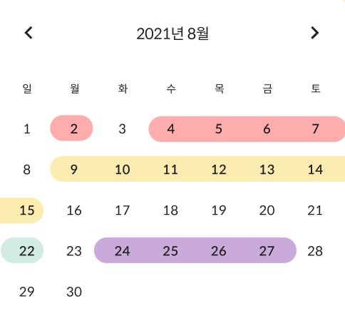
최종 목표
calendar 외 다른 컴포넌트 배치하기
먼저, JTAC는 CollectionView로 구현되어 있는데, JTAC로 커스텀 할 수 있는 부분은
딱 이만큼이다. 그 외에는 JTAC랑 상관 없는 부분이니까 오브젝트 라이브러리에서
평소대로 뷰 만들듯이 해 주면 된다.
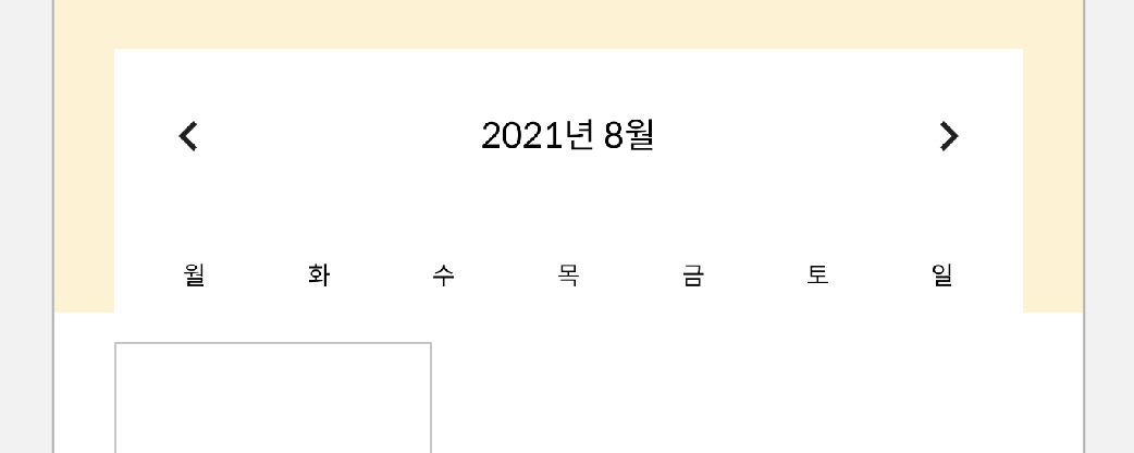
양쪽 화살표는 UIButton, 중간 년,월 텍스트는 UILabel,
월~일 텍스트는 UILabel을 StackView에 넣어줬다.
cell 연결하기
기본적으로, 캘린더라 함은.,, 숫자가 떠야 하므로,,, 그것부터 해보자
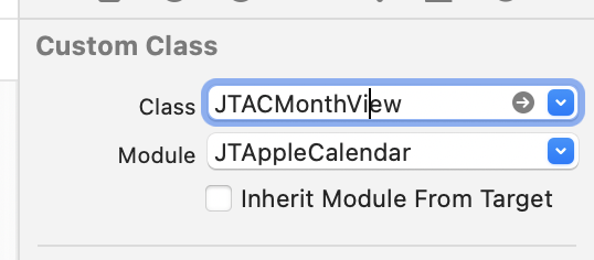
CollectionView의 Class 연결부터 해준다. JTACMonthView로 해주면 된다.
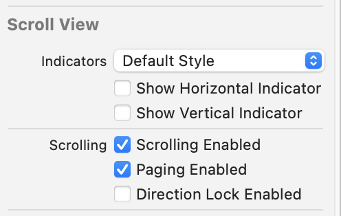
Indicator 숨겨주고, Paging도 Enable 시켜준다. (scroll direction 도 horizontal로 바꿔준다)
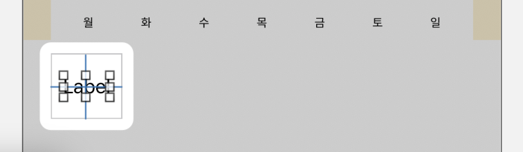
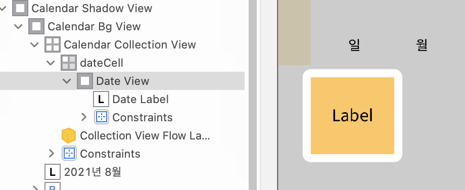
Cell에 UILabel 하나 올려주고, horizontal, vertical center constraint 잡아준다.
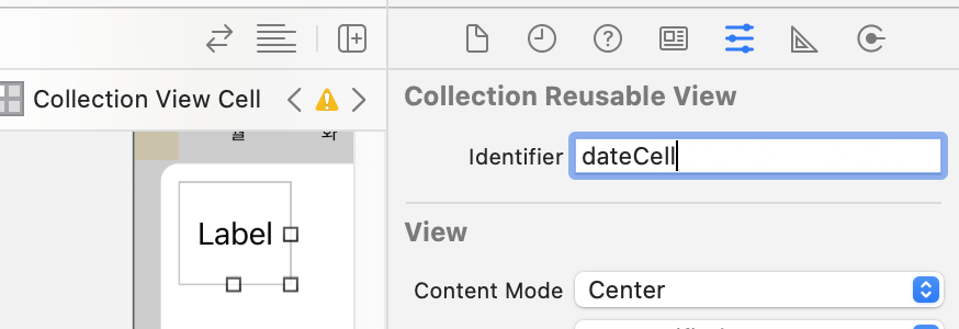
Reusable Identifier는 dateCell로 지정해준다.
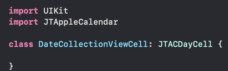
cell에 연결해 줄 Cell swift file을 만든다. 이 때, JTACDayCell의 SubClass로 만들고,
JTAppleCalendar도 import 해 준다.
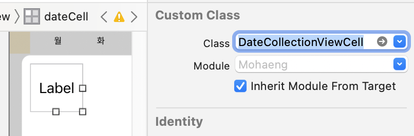
Custom Class 연결 해 준다.
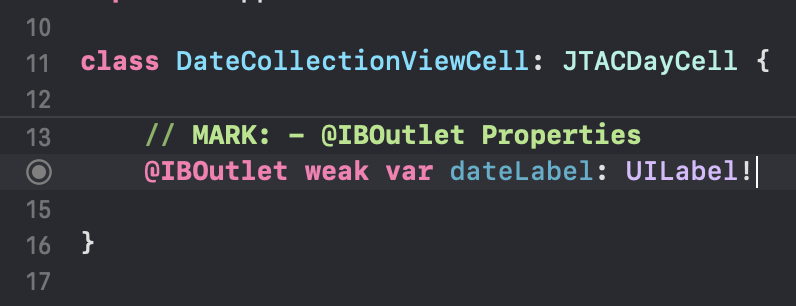
UILabel @IBOutlet 연결도 해 준다.
기본 Delegate, DataSource 연결하기
뷰컨 파일로 와서,
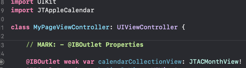
JTAC import 해 주고 collectionView도 @IBOutlet 연결 해 준다 (JTACMonthView)
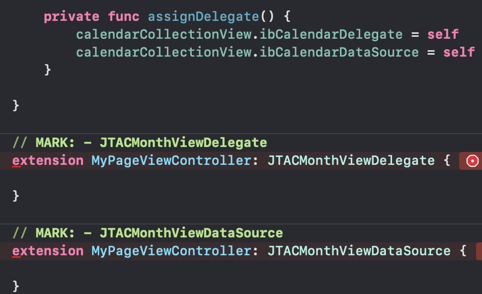
delegate도 위임해주고, JTACMonthViewDelegate랑
JTACMonthViewDataSource 프로토콜을 따르는 extension을 만들어 준다.
빨간 줄 뜬 곳을 눌러서 fix를 누르면 자동으로 stubs들이 채워지는데,
요것들을 하나하나 채워보자
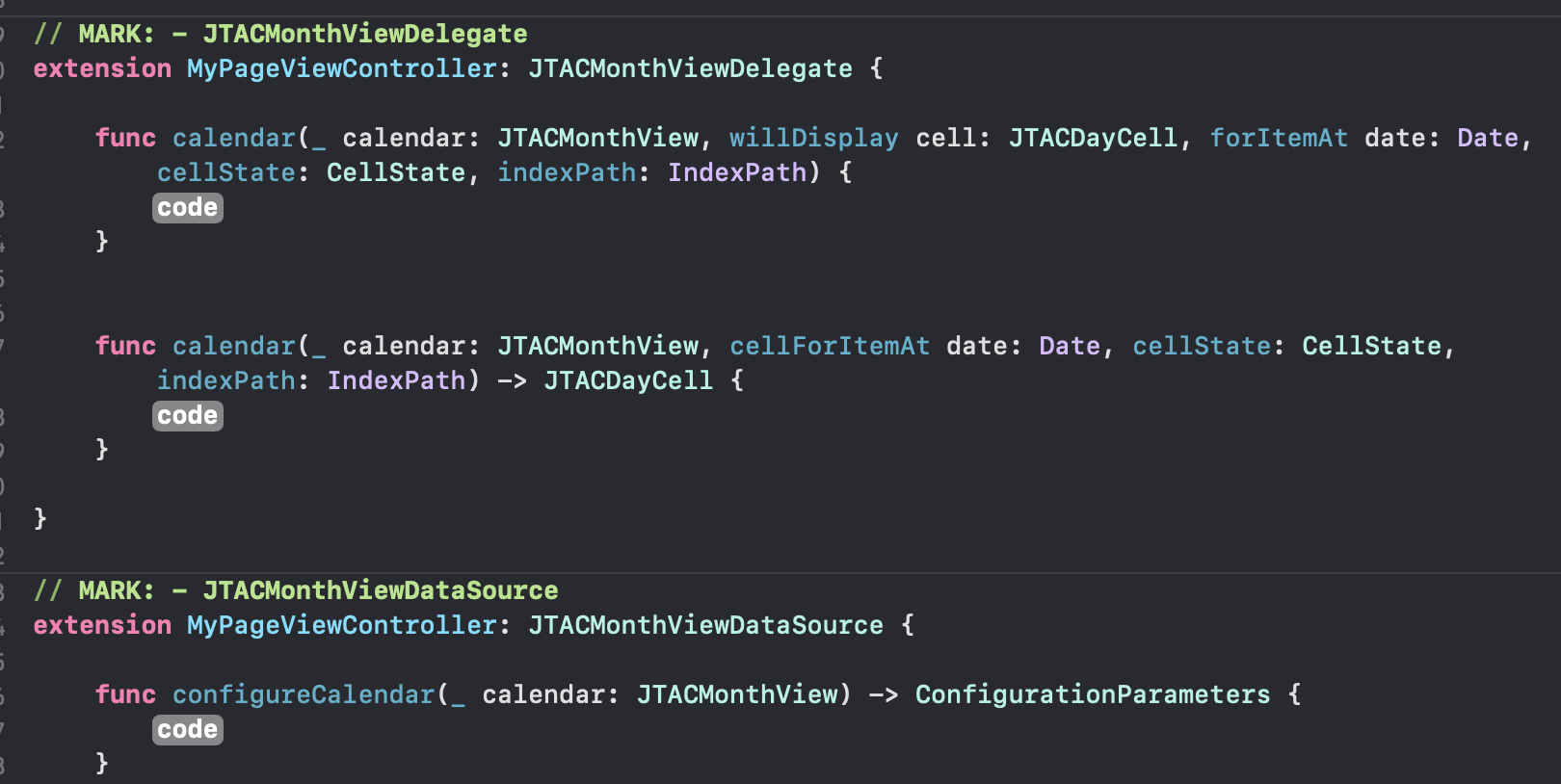
// MARK: - JTACMonthViewDelegate
extension MyPageViewController: JTACMonthViewDelegate {

    func calendar(_ calendar: JTACMonthView, willDisplay cell: JTACDayCell, forItemAt date: Date, cellState: CellState, indexPath: IndexPath) {
        guard let cell = cell as? DateCollectionViewCell else { return }
        cell.dateLabel.text = cellState.text
    }

    func calendar(_ calendar: JTACMonthView, cellForItemAt date: Date, cellState: CellState, indexPath: IndexPath) -> JTACDayCell {
        guard let cell = calendar.dequeueReusableJTAppleCell(withReuseIdentifier: Const.Xib.Identifier.dateCell, for: indexPath) as? DateCollectionViewCell else {
            return JTACDayCell()
        }
        cell.dateLabel.text = cellState.text
        return cell
    }

}

// MARK: - JTACMonthViewDataSource
extension MyPageViewController: JTACMonthViewDataSource {

  	// 위에서 let formatter = DateFormatter() 만들어 둠

    func configureCalendar(_ calendar: JTACMonthView) -> ConfigurationParameters {
        formatter.dateFormat = "yyyy MM dd"
        formatter.timeZone = Calendar.current.timeZone
        formatter.locale = Calendar.current.locale

        let startDate = formatter.date(from: "2021 08 01")!
        let endDate = Date()
        return ConfigurationParameters(startDate: startDate, endDate: endDate)
    }

}
이렇게 튜토리얼대로 따라하면
오오…(o.o)b 페이징도 잘 된다.
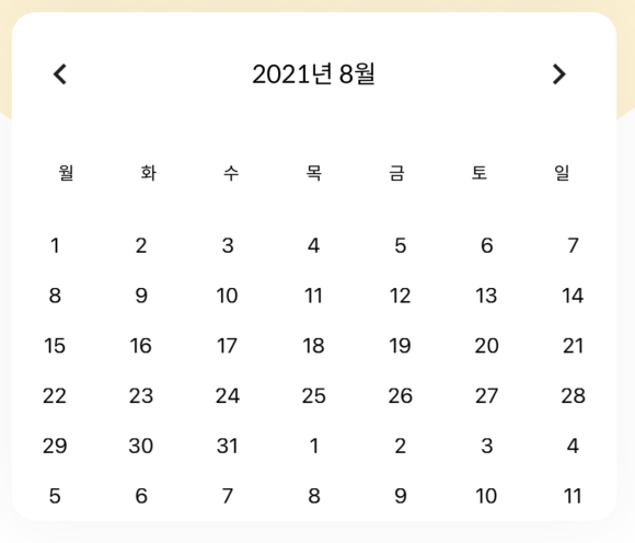
cell 크기 조절하기
cell에 배경색을 넣어서 확인 해 보면,
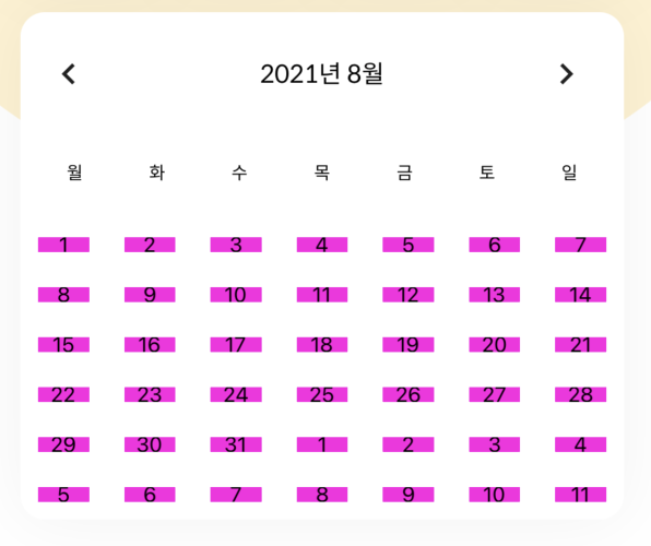
이렇게 cell 간 spacing이 있는 걸 확인할 수 있다.
calendarCollectionView.minimumLineSpacing = 0
calendarCollectionView.minimumInteritemSpacing = 0
이렇게 spacing을 없애주면 된다.
(나중에 디자인 때문에 line spacing을 좀 줬다)
multiple selection, range selection
내가 구현할 캘린더는 여러개의 date가 선택되어야 하고,
연속으로 선택된 date는 이어진 모양으로 표시가 되어야 하기 때문에
calendarCollectionView.allowsMultipleSelection = true
calendarCollectionView.allowsRangedSelection = true
MultipleSelection, RangedSelection을 true로 설정해준다.
선택됐을 때 표시될 UIView도 cell에서 UILabel 뒤에 만들어 준다.
JTAppleCalendar에서는 cell에 대한 state를 cellState로 묶어서 제공해주는데,
그 중에 selectedPosition() 이라는 메소드가 있다.
cellState log를 찍어보면 아래와 같은 정보들을 얻을 수 있다.
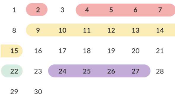
CellState(isSelected: true, text: "25", dateBelongsTo: JTAppleCalendar.DateOwner.thisMonth, date: 2021-08-24 15:00:00 +0000, day: JTAppleCalendar.DaysOfWeek.wednesday, row: (Function), column: (Function), dateSection: (Function), selectedPosition: (Function), cell: (Function), selectionType: Optional(JTAppleCalendar.SelectionType.programatic))참고참고~
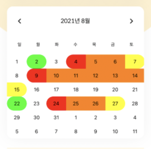
- .full -> 연두색 : 1 cell = 1 range일 때
- .left -> 빨간색 : range에서 맨 왼쪽 cell
- .middle -> 주황색 : range에서 가운데 cell들
- .right -> 노란색 : range에서 맨 오른쪽 cell
- .none -> 흰색 : 선택 되지 않은 상태
이 selectedPosition에 따라 (enum case 반환)
방금 깔아준 UIView의 cornerRadius값, maskedCorners들을 바꿔주면 된다.
(위 색 예시에서는 여기서 색도 지정해줬었다)
        // selectedPosition에 따라 dateView layer rounding
        switch cellState.selectedPosition() {
        case .left:
            myCustomCell.dateView.layer.cornerRadius = myCustomCell.frame.height / 2
            myCustomCell.dateView.layer.maskedCorners = [.layerMinXMaxYCorner, .layerMinXMinYCorner]
        case .middle:
            myCustomCell.dateView.layer.cornerRadius = 0
            myCustomCell.dateView.layer.maskedCorners = []
        case .right:
            myCustomCell.dateView.layer.cornerRadius = myCustomCell.frame.height / 2
            myCustomCell.dateView.layer.maskedCorners = [.layerMaxXMaxYCorner, .layerMaxXMinYCorner]
        // full : 한 cell이 left, right, middle 다 차지 할 때 (1cell = 1range)
        case .full:
            myCustomCell.dateView.layer.cornerRadius = myCustomCell.frame.height / 2
            myCustomCell.dateView.layer.maskedCorners = [.layerMaxXMaxYCorner, .layerMaxXMinYCorner, .layerMinXMaxYCorner, .layerMinXMinYCorner]
        default: break
        }

        if !cellState.isSelected { myCustomCell.dateView.backgroundColor = .white }
    }
left, middle, right, full에 대해서는 dateView를 깎아주고, 꼭짓점을 지정해줬다. 그리고 none일 때에는 cell이 selected되지 않은 상태이므로 배경색을 흰 색으로만 지정해줬다.
그리고 이걸 함수로 만든 후
willDisplay, didSelectDate, didDeselectDate에서 호출해주면 되는데,
내가 구현해야 하는 캘린더는
서버에서 날짜랑 property를 받아와서, 뷰가 뜨기 전 선택된 상태로 만들어주는 작업이 필요했다.
이를 위해 해야 하는 것은
- 날짜 데이터 오는 거 변환하기
- 날짜를 선택하기
- 날짜를 선택할 때, property에 따라 배경 색 지정하기
차근차근 고고,,
날짜 데이터 오는 거 변환하기
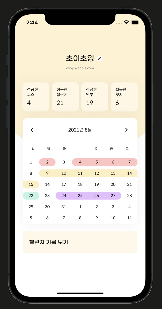
우선, 서버에서 주기로 한 모델 형식대로 더미데이터를 만들어 준다.
    // 더미데이터
    var myPageData = MyPage(nickname: "초이초잉", level: 7, email: "choyi@apple.com", characterType: 1, characterImage: "이미지", completeCourseCount: 6, completeChallengeCount: 28, postCount: 1, badgeCount: 20, calendar: [
        MyPageCalendar(property: 0, date: ["2021-08-02"]),
        MyPageCalendar(property: 0, date: ["2021-08-04", "2021-08-05", "2021-08-06", "2021-08-07"]),
        MyPageCalendar(property: 2, date: ["2021-08-09", "2021-08-10", "2021-08-11", "2021-08-12", "2021-08-13", "2021-08-14", "2021-08-15"]),
        MyPageCalendar(property: 3, date: ["2021-08-22"]),
        MyPageCalendar(property: 6, date: ["2021-08-24", "2021-08-25", "2021-08-26", "2021-08-27"])
    ])
date string 정확히 어떻게 오는 지 몰라서,
그냥 서버 api 명세서에 있던 대로 가져왔다. (나중엔 시간 분 초 까지 다 올거라, 고쳐야 하는 부분)
지금 MyPageCalendar가 여러 개 있고, 그 안에 date 배열에 있다.
요걸 Date() 형으로 만들어서 저장해야 하는데, 이 때 property를 고려해야 하기 때문에
이차원 배열로 만들어 줘야 한다.
var rangeDates: [[Date]] = []
private func setRangeDates() {
        guard let gregorianCalendar = NSCalendar(calendarIdentifier: .gregorian) else { return }
        for dateRange in myPageData.calendar {
            var rangeDate: [Date] = []
            for date in dateRange.date {
                let dateArray = date.split(separator: "-").map { Int(String($0)) }
                let dateComponent = DateComponents(year: dateArray[0], month: dateArray[1], day: dateArray[2])
                let date = gregorianCalendar.date(from: dateComponent as DateComponents)!
                rangeDate.append(date)
            }
            self.rangeDates.append(rangeDate)
        }
    }
setRangeDates() 후 rangeDates를 print해 보면
[[2021-08-01 15:00:00 +0000], [2021-08-03 15:00:00 +0000, 2021-08-04 15:00:00 +0000, 2021-08-05 15:00:00 +0000, 2021-08-06 15:00:00 +0000], [2021-08-08 15:00:00 +0000, 2021-08-09 15:00:00 +0000, 2021-08-10 15:00:00 +0000, 2021-08-11 15:00:00 +0000, 2021-08-12 15:00:00 +0000, 2021-08-13 15:00:00 +0000, 2021-08-14 15:00:00 +0000], [2021-08-21 15:00:00 +0000], [2021-08-23 15:00:00 +0000, 2021-08-24 15:00:00 +0000, 2021-08-25 15:00:00 +0000, 2021-08-26 15:00:00 +0000]]
요렇게 잘 들어가 있는 걸 확인할 수 있다.
날짜를 선택하기
JTAppleCalendar에서 제공하는 selectDates()를 사용하면 된다.
private func selectRangeDate() {
    for rangeDate in rangeDates {
        calendarCollectionView.selectDates(rangeDate)
    }
}
날짜를 선택할 때, property에 따라 배경 색 지정하기
아까 위에서 cellState.selectedPosition()에 따라 dateView의 corner를 설정해줬는데,
그것과 property에 따라 색 지정하는 부분을 묶어서 함수로 만들었다. (같이 배경색을 지정해줘야 하기 때문)
// selectedPosition에 따라 range selection 표시
    func handleCellSelection(view: JTACDayCell?, cellState: CellState) {
        guard let myCustomCell = view as? DateCollectionViewCell else { return }

        // dateView background color 찾기
        for (idx, rangeDate) in rangeDates.enumerated() {
            if rangeDate.contains(cellState.date) {
                guard let propertyColor = AppCourse(rawValue: myPageData.calendar[idx].property)?.getBubbleColor() else { return }
                myCustomCell.dateView.backgroundColor = propertyColor
            }
        }

        // selectedPosition에 따라 dateView layer rounding
        switch cellState.selectedPosition() {
        case .left:
            myCustomCell.dateView.layer.cornerRadius = myCustomCell.frame.height / 2
            myCustomCell.dateView.layer.maskedCorners = [.layerMinXMaxYCorner, .layerMinXMinYCorner]
        case .middle:
            myCustomCell.dateView.layer.cornerRadius = 0
            myCustomCell.dateView.layer.maskedCorners = []
        case .right:
            myCustomCell.dateView.layer.cornerRadius = myCustomCell.frame.height / 2
            myCustomCell.dateView.layer.maskedCorners = [.layerMaxXMaxYCorner, .layerMaxXMinYCorner]
        // full : 한 cell이 left, right, middle 다 차지 할 때 (1cell = 1range)
        case .full:
            myCustomCell.dateView.layer.cornerRadius = myCustomCell.frame.height / 2
            myCustomCell.dateView.layer.maskedCorners = [.layerMaxXMaxYCorner, .layerMaxXMinYCorner, .layerMinXMaxYCorner, .layerMinXMinYCorner]
        default: break
        }

        if !cellState.isSelected { myCustomCell.dateView.backgroundColor = .white }
    }
AppCourse 쏠쏠하게 잘 써먹는 중,, 이차원 배열로 만든 이유가 여기에 있다.
Date가 속하는 배열의 (2차원 배열 내) 인덱스로 더미데이터에서 property값을 가져올 수 있기 때문.
이를 AppCourse의 rawValue로 사용해서 color를 빼온다.
    func configureCell(view: JTACDayCell?, cellState: CellState) {
        guard let cell = view as? DateCollectionViewCell  else { return }
        cell.dateLabel.text = cellState.text
        handleCellSelection(view: cell, cellState: cellState)
    }
방금 만든 handleCellSelection 메서드와 cell에 숫자를 입력하는 부분을 하나의 함수로 만들어줬다.
그리고 delegate를 아래와 같이 수정해주면 된다.
// MARK: - JTACMonthViewDelegate
extension MyPageViewController: JTACMonthViewDelegate {

    func calendar(_ calendar: JTACMonthView, willDisplay cell: JTACDayCell, forItemAt date: Date, cellState: CellState, indexPath: IndexPath) {
        configureCell(view: cell, cellState: cellState)
    }

    func calendar(_ calendar: JTACMonthView, cellForItemAt date: Date, cellState: CellState, indexPath: IndexPath) -> JTACDayCell {
        guard let cell = calendar.dequeueReusableJTAppleCell(withReuseIdentifier: Const.Xib.Identifier.dateCell, for: indexPath) as? DateCollectionViewCell else {
            return JTACDayCell()
        }
        self.calendar(calendar, willDisplay: cell, forItemAt: date, cellState: cellState, indexPath: indexPath)

        return cell
    }

    func calendar(_ calendar: JTACMonthView, didSelectDate date: Date, cell: JTACDayCell?, cellState: CellState, indexPath: IndexPath) {
        configureCell(view: cell, cellState: cellState)
    }

    func calendar(_ calendar: JTACMonthView, didDeselectDate date: Date, cell: JTACDayCell?, cellState: CellState, indexPath: IndexPath) {
        configureCell(view: cell, cellState: cellState)
    }

}
터치 막고, 화살표도 동작하게 해야 하지만… 우선 완성 ( ◠‿◠ )